
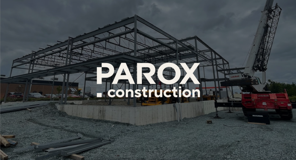
Parox construction
A symbol of trust and expertise
Construction PAROX stands out for its commitment to innovation and quality within the construction industry. Founded in 2000, the company has built lasting client relationships by prioritizing transparency and collaboration. PAROX is recognized for its ability to turn client visions into tangible realities, particularly in the industrial, commercial, and agri-food sectors.
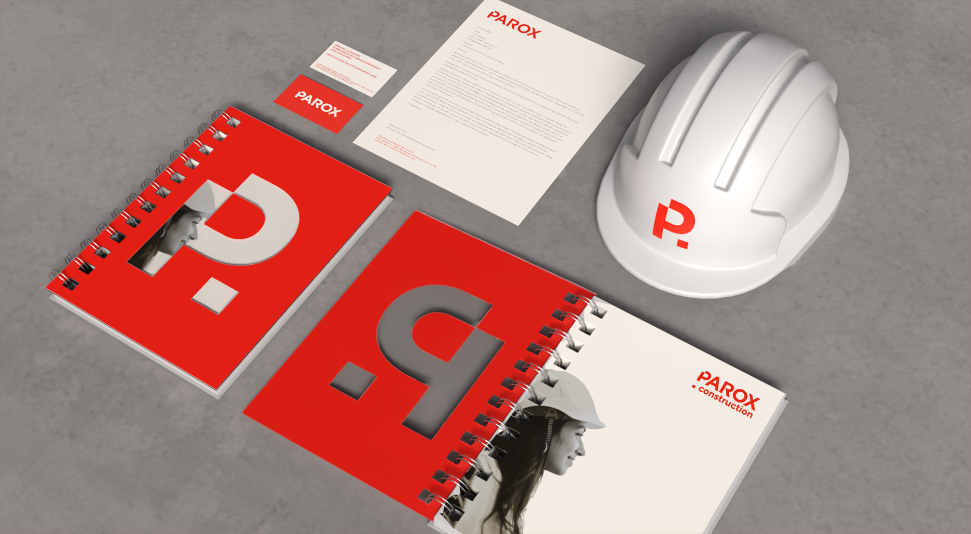
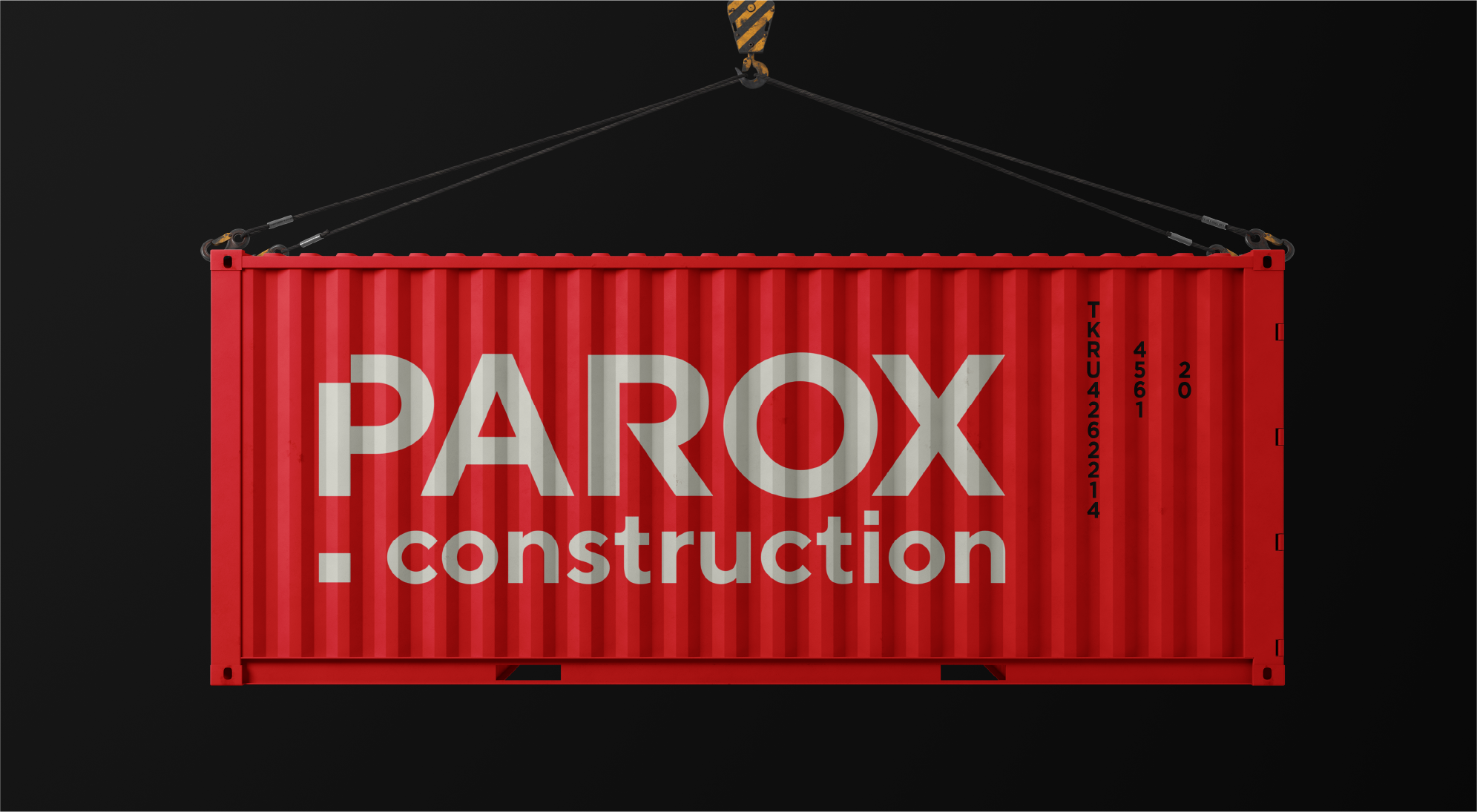
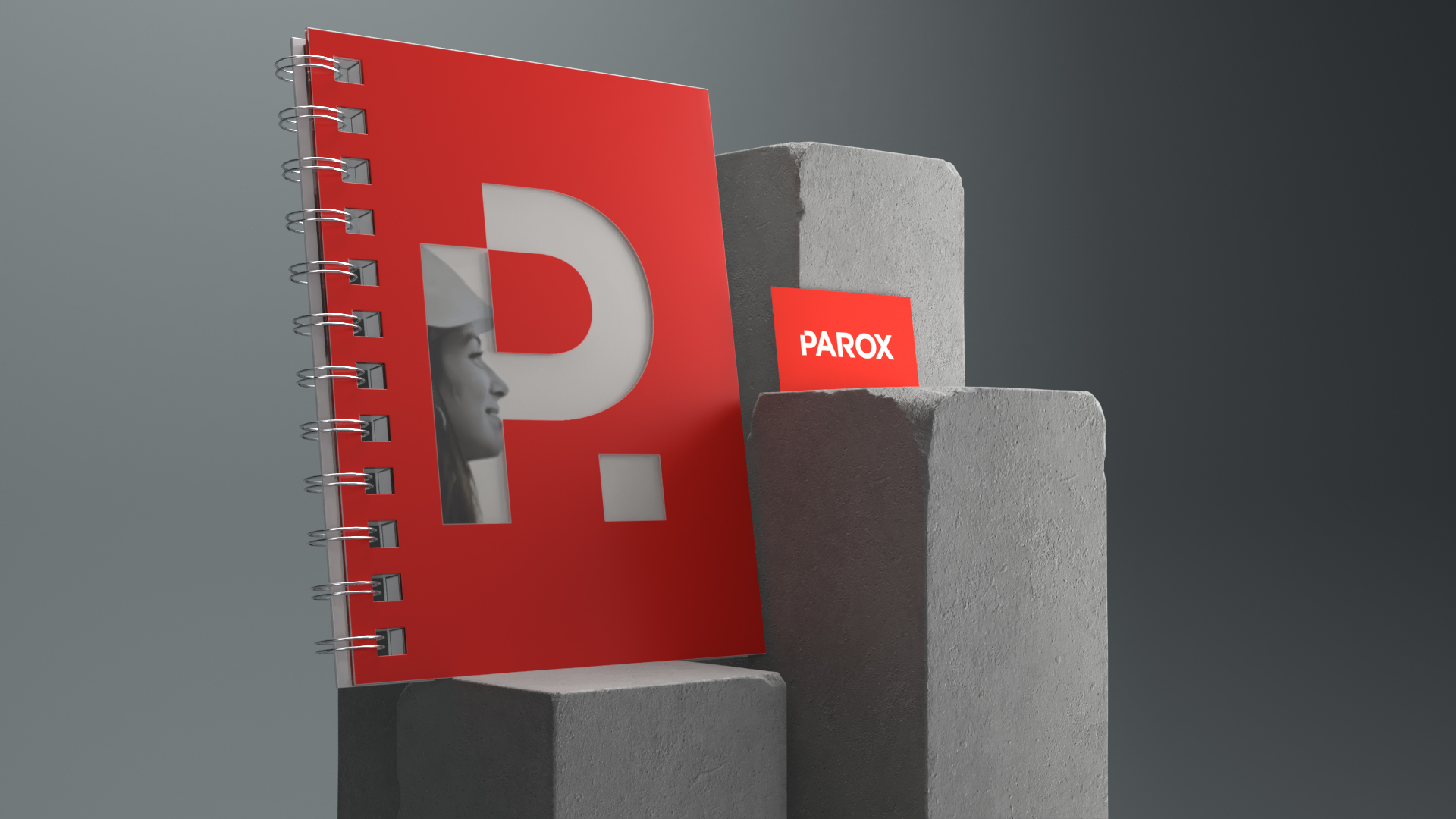
To reflect this dynamic identity, we developed a new brand identity that embodies the company's strength and energy. The vibrant red logo symbolizes innovation and passion while ensuring immediate recognition linked to the previous design. The bold, modern typography conveys efficiency and robustness, while the logo's structure evokes the precision essential to every project. This visual approach reinforces PAROX’s core values—commitment, pride, teamwork, and clarity—while affirming its role as a trusted partner in the industry.
Services